Cat: Thank you for taking the time, Tom. You are a graphic artist and you’ve designed some awesome posters/DVD covers. How did you first get interested in graphic design?
Tom Hodge: Im Dyslexic so my spelling is awful and Dyscalculia so my maths is shot too, basically all my brain power is directed towards art and design! I was drawing from an early age and I’ve always had a big passion for films so I used to draw allot of my own video covers when i was growing up, from that I got into college doing a 2 year design course and then onto 3 years at uni doing design again and film studies. As most people do I went into design thinking about all the cool jobs like film posters, Album covers etc but the reality is you end up coming out working on logos and more straight laced design work. Allot of people who trained in design left the course to go onto totally unrelated design jobs.
Cat: How did the whole thing started? You are from England and the people overseas wants a Dude Designs poster. Must have felt great for you!
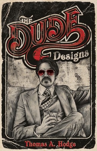
Tom Hodge: When I finished university i bounced around from design company to company trying out different designs disciplines finding where I fit best and seeing all these trendy artists popping up at galleries like Adam Neat, Flail and Bansky who had there one creative angle with the work they produced so i was always trying to find a platform where i could really express myself, inject some personality and style into the work. The bits really started to fall into place when i created the Dude Designs blog and experimenting with more film orientated art which started with the NIGHT OF THE LIVING DEAD flyer i created for the Midnight Movies. It’s very roar and more photoshop imagery based that me later work but you can see the style starting!
Yeah its a great buzz, I think I’ve also put a few bigger in house and design studios noses out of joint with the work, but its good to shake up the hornets nest a bit. Poster design has become quite dominated by only a few big agencies, so me being this one guy out there on my own doing it is a big challenge, I really do appreciate peoples support for the work!
Cat: Let’s talk about some of your posters. Tell me what do you remember when you think back on:
– THE INNKEEPERS (Ti West)
Tom Hodge: I was very excited when I got contacted by Larry Fessnden from Glass Eye Pix about this one. I didn’t actually put two and two together who Larry actually was until after I had finished the poster, I’m a massive fan of his films and I’m so bad with names added to the mad panic pressure of the job I just didn’t think hey its that Larry!!!
I contacted Glass Eye Pix after Hobo just saying i loved there work. Don’t know if you have checked out there site but the guy have been responsible for some of the most original horror / fantasy films of recent times (some of its really out there). They have a catalogue of amazing artists as well as directors too, with the likes of Jeff Graces scores and Gary Pullin the artist who illustrated the amazing radio show series they produce called TALES FROM THE PALE. I’ve been following there stuff for years now and think its going to be one of the companies which people will look back on and realise was the starting ground of some big talents, seriously check out there back catalogue!
Anyway, I wanted in on that action so sent an email, didn’t hear back for a while then all the sudden had a email from Larry about working on Ti Wests new Innkeepers movie poster for SXSW, it was a bit of a mad panic job and I did feel a lot of performance anxiety, working with such great names. Ti was very closely involved with the direction of the design as the was no trailer or film to view, I never got to see a frame of footage. Ti supplied a series of old posters for different design routes to explore and I think I produced a few concepts. Some arm twisting did go on, selecting the final design route and i really pushed for the main art deco one (i even offered to waving my fee at one point), they all had this antiquated feel but I felt that had the best alternative concept, and Ti agreed if we did both that and the keyhole route.
It was never supposed to be a total horror vibe, I listened to a lot of old dance hall 20’s music while designing for inspiration as there was no film to see and I based it on a lot of the old pan horror novels, to get that classic ghost vibe with a movie twist. I think it shocked a few fans after HOUSE OF THE DEVIL designs being so horror orientated but that wasn’t the route and I still stand by it as one of my best designs to date I love it and I really think now it captured the vibe of the film spot on. If I remember right Ti said so too at the time!! (not to blow my own trumpet). Its interesting how the key art effects a viewers mindset when sitting down to watch a film, it can really effect your first impressions of a film, (like how a person smells when you meet them almost!) and my feeling is from seeing Ti’s Films is that they never want to be seen going in as just straight horror flicks. He tries to get around that old hump of relating to the characters by Misdirecting the audiences attention into this slow burn character dialogue driven story line, if four kids go into the woods/scary house you know four kids are going to die, so who cares right, the first half of the movie is redundant, but HOUSE OF THE DEVIL and TRIGGER MAN etc, if you develop a story more draw out the characters properly when that scare happens it holds more punch and emotional reaction and I think the poster can really play a part in developing the movies mystique not just a sales product!
– DEAR GOD NO (James Bickert)
Tom Hodge: This was a far out one I had a lot of fun with this design and James was a great director to work with. I’m a big fan of bikers, breads and boobs so this really played into my hands (some friends have joked i just illustrated myself in the poster, sadly not though i cant grow a full beard just the handle bar tash!!). I wanted to create a really ballsy quintessential biker grindhouse exploitation poster something you could see hanging in a Harley garage or biker bar and i did actually get my wish with a screening James had at Route 56 Motorcycle Emporium / Rockies Bar DEAR GOD NO! screening.
James has a background as a designer too, but was totally open to what I wanted to do with the design. All he really requested was guns bikes and boobs and not to worry about censoring the nipples!!! I was inspired by the works of Frank Frazetta who created all these iconic fantasy barbarian warrior photos. and have a modern twist of the biker on his hog with the damsel laid out below. Again I didn’t get to see the film until recently so its always fun to watch them after the fact to see if you picked up on all the right points does it really explain the story line correctly etc…
Cat: I noticed your designs for the first time when I saw the HOBO WITH A SHOTGUN poster. The movie is not yet been published here, but many genre fans knows your poster. What can you tell me about the working process?
Tom Hodge: Hobo wasn’t a straight forward process to be honest as. I generally read allot of film news/press sites so I know what’s going on, and I knew about Hobo from the whole Grindhouse thing, then when i saw they had the Hauer it sparked my interest and the trailer totally blew me away, it was all right up my street. I wasn’t as over excited by the first piece of poster art they first released and the film still hadn’t been picked up for distribution yet so I knew there was a window of opportunity and I sent the guys an email from there address on the blog saying hey…the email got passed on to Jason the director who really liked my old work and they where like great love to see what you can come up with, but that was it man!
Usually you get some assets to work with (screen shots, stills copy of the movie… some times a logo. I prefer to create my own though as I can make it match the whole style of the poster). However they might have thought I was a chancer looking for some stills to post online or just a fan art guy so they weren’t taking any chances and consequently I had nothing to work with at all apart from the trailer and what i could grab off the web. Which is why the two drakes sons are not featured in the poster as I really had no idea that those characters where involved as much or I would have put them in for sure.
I re-jigged the logo slightly to fit better the a poster design and then just went to town. I did the old Drew Struzan technique of taking some photos of my self posing for reference (so thats actually my body on the poster not Hauers). Aside from the wrinkle issue the poster never had any amends, what you see is what i drew straight off the bat, which is very rare! Directors want to throw in more characters or change bits but none of that happened and i think it works for the better. Simple and concise in its execution as I try and tell people just because its in the movie it doesn’t need to be on the poster. I pulled from so many mental references of film posters I love that it just came together and I had no time to look back it was a small window of opportunity and a tight dead line before they forgot who the hell I was! Luckily it all turned out for the best.
Cat: Your newest work ist the MADISON COUNTY poster and it looks terrific!
Tom Hodge: Yes the guys are working on distribution now so it should be out there in 2011. The guys wanted a classic slasher vibe to get the message of what they where trying to do with the film. So this was a perfect way of getting that across to the audience.
Cat: Your poster design for FATHER’S DAY has won a award for the „Best Poster“ at the Toronto After Dark Film Festival. Congratulations! How did you hear about it?
Tom Hodge: Thanks. Yeah I was very happy about that, the films been picking up some incredible reviews and press so I hope its going to explode in 2012. The guys contacted me originally, they where very passionate about the project and that sort of won me over,
again it was a full classic 80s VHS inspired exploitation design to play around with, im a big fan of character driven posters so if you can fit a cool looking dude and sexy girl on the cover its always a bonus!!
Cat: Can you tell me some of your favourite horror movies?
Tom Hodge: I’m a big fan of all the classics THE THING of course, ALIEN (i cant wait to see Prometheus), THE SHINING, NIGHT OF THE LIVING DEAD, RETURN OF THE LIVING DEAD, FRIDAY THE 13th PART 3, anything Carpenter pre 90’s … then the more arty independent arty horrors like SESSION 9, PONTYPOOL, LAST WINTER, WENDIGO. I also love cheesy 80s monster horror films like HOUSE, CRITTERS, GHOULIES, THE GATE, MAXIMUM OVERDRIVE, when horror was fun, I’m an 80’s child so I have to admit I’m not a big fan of the more serious torture porn genre!
Cat: What are you working on right now?
Tom Hodge: I’ve just finished on a teaser poster for HYPOTHERMIA another Glass Eye Pix film staring Michale Rooker and two very different style posters for WOULD YOUR RATHER which is staring Brittany Snow and Jeffrey Combs, also a Kustom Kulture Documentary called FLAKE & FLAMES, and I’m about to start work on A LITTLE BIT ZOMBIE, a comedy horror if that all works out. Being freelance you never know whats around the corner, hopefully I can pic up a big studio project soon, I’d love to get the old classic poster art style back in the main stream again!
Cat: If you could choose a film poster that you could do, what would you choose?
Tom Hodge: Oh man, I would have loved to have done the poster for TUCKER &DALE and STAKE LAND, classics wise er SPLIT SECOND with Rutguer Hauer anything with Burt Reynolds in or Lee Marvin!!!
Cat: Thank you for the interview. I wish you much success for the future and I hope we will see more of your awesome work.
Tom Hodge: Thank you.
